Top 10 Ugliest Paint Schemes in NASCAR History
Top 10 Ugliest Paint Schemes in NASCAR History
By: Brian Cotnoir
I’ve talked about the Best Paint Schemes in NASCAR,
and now I’m here to talk about the Ugliest.
Sometimes a paint scheme looks bad because of whose sponsoring the car,
and other times it’s a real bad color combination, but whatever the reason
these are some of the most hideous Paint Schemes to have ever graced a NASCAR
track.
10.) Dave
Marcis, Prodigy paint scheme
This one is so ugly, that it’s kind of cool.
For me the big issue is the combination of Purple & Green, and
the Neon Orange numbers make it a little better, but this car is still looks
like a disaster.

9.) Joey Logano, AAA Insurance paint scheme
Joey Logano has had a number of awesome paint
schemes while driving for Roger Penske, however this red, white, and blue
monstrosity is not one of them. I think
Logano and Penske should call AAA Insurance and see if they can use their
policy to give this paint scheme a complete makeover.

8.) Jimmie
Johnson, Planes Movie paint scheme
When NASCAR’s use paint schemes to promote movies,
they’re typically hit or miss. This
paint scheme driven by Jimmie Johnson at Pocono in 2013 to promote the film Planes (a spinoff movie of the Cars franchise starring Dane Cook as a
talking plane) really just crashed and burned.

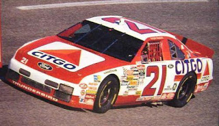
7.) Kenny
Wallace, Furniture Row paint scheme
Furniture Row Racing was never going to win any
contests for creativity with their paint scheme; for most of their existence the
car was just flat black with red numbers and white Furniture Row lettering. However, when they first
entered NASCAR they picked quite a bad combination of colors, I’m glad they
decided to go with the all black look rather than this monstrosity.

6.) Bill
Elliot, McDonalds Big Mac (paint scheme)
When Bill Elliot was an Owner-Driver his McDonald’s
paint schemes were some of the most recognizable on the track, however this paint scheme he ran to promote
the Big Mac in 1998 looks like it was designed by an 4th grader in
some NASCAR art completion. Compared to
the other McDonald’s paint schemes Awesome Bill ran, this one belongs in the
trash.

5.) Dale Earnhardt Sr., 2000’s The Winston Paint
Scheme
Question:
Who the hell thought this paint scheme looked good? I mean Dale Sr. was known as “The Man in Black” and “The Intimidator”; yeah he wasn’t
intimidating anyone with this rainbow paint scheme. To me this car looks like he lost a bet to
Jeff Gordon and had to run a rainbow paint scheme for one race, and so Dale Sr.
just poured a bunch of bleach on it, hoping to ruin it and then all the colors
melted together.
 |
| No.....just.....NO |
4.) Matt
Kenseth, The Pink Ford Eco Boost
I understand that NASCAR runs the pink cars every
year to promote awareness for Breast Cancer, but this paint scheme that Matt
Kenseth used when he won at Talladega in 2012 is not good. The combination of Black, White, and Pink,
mixed with Fords Blue logo just look so bad.

3.) Corey Lajoie, 2019 Daytona 500 Car
Aaaand the award for CREEPIEST race car ever goes
to Corey Lajoie for this car he entered in the 2019 Daytona 500. I like Corey Lajoie—his father Randy was one
of my favorite drivers growing up—but this car looks hideous. It did gain Lajoie some attention though, and
it did help him secure sponsorship from Old Spice for a couple races, but still
I shudder a bit whenever I think of this car.
 |
| Terrifying! |
2.) Ken Scharder, Call ATT paint scheme
The only think more terrifying than Corey Lajoie’s
face on a NASCAR is seeing legendary prop comic Carrot Top on a NASCAR hood
like this won run by Kenny Schrader in association with 1-800-Call ATT (of
which Carrot Top was a paid spokesman for).
 |
| Nightmare Enducing! |
1.) Lake Speed, Cartoon Network Birthday Car
I was torn between the Top 3, but I decided to give
the Ugliest Paint Scheme in NASCAR to Lake Speed’s Cartoon Network sponsored
car. As a kid the Cartoon Network cars
were some of my favorites, I loved seeing my favorite cartoon characters on
NASCAR’s, but the Birthday Cake Ford from 1998, was just too much. The combo of Pink & Blue and the yellow
numbers did not mash very well, and the whole car looks like a giant pastel
colored mess.

Well that is what I think were some of the Ugliest NASCAR
paint schemes in History; do you agree? Are there any obvious ones that you
think I missed?
Top 10 Most Iconic Paint Schemes in NASCAR History
Top 10 Most Iconic Paint Schemes in NASCAR History


Comments
Post a Comment